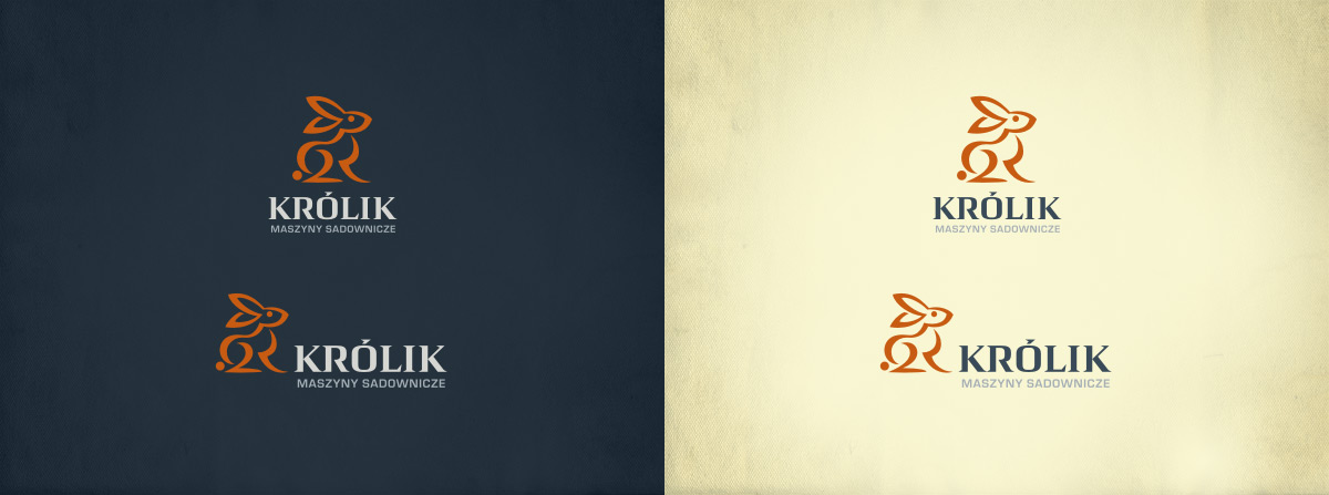
This time my job was to design a logo for a producer of orchard equipment. The company is located in Warka, Poland, and it has been selling its products since 1994, mainly domestically, but also in several other European countries (including Austria, Bulgaria, Spain, Germany and Ukraine). It has been able to establish a great reputation among their clients by providing high-performance quality products, which include herbicide booms used for eradication of weeds, tree and bush planters, tippers and carts for handling box pallets.
Even though it was more than 15 years since its foundation, it still operated pretty much as a no-logo business (do not try it at home!). I have been approached by Artur Królik to change this situation.
The first step in the design process is always gathering information. Here is a quick summary that should give you some insight into specifics of this job:
After digesting the above information for a while and going through hundreds of rabbit photos I started sketching. Real pen on real paper.
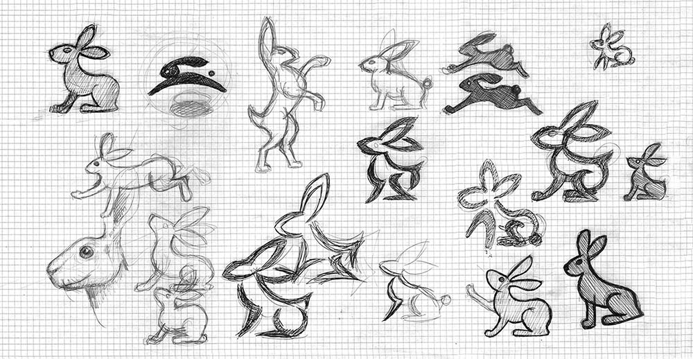
Next stage was to convert this doodles into vector graphics and presenting them to the client.
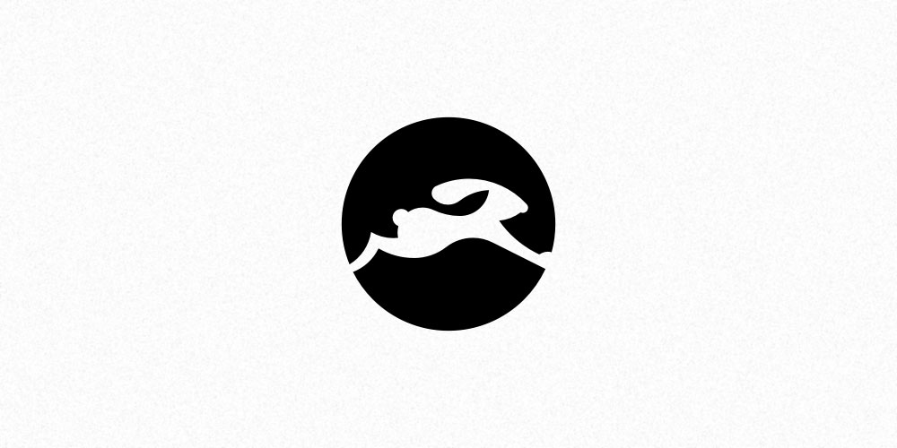
Well, this is just plain simple boring and not good at all...
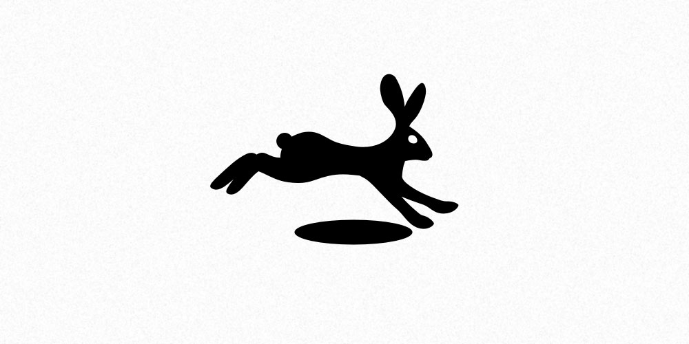
The most lifelike version of a rabbit. I tried to make it dynamic and some animal agility to make it an opposite of a cute little bunny sitting in a flowery meadow. Unfortunately, it seems uninspired and dull. I don't think that later development might have helped to change it.
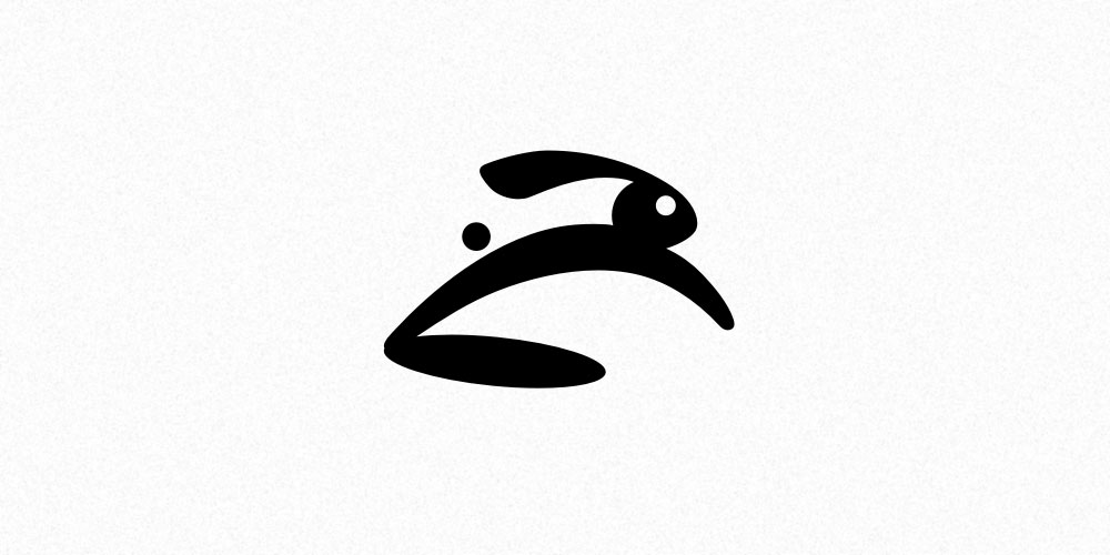
In a way, this is a continuation of the direction started in the previous concept. Once again it is a jumping rabbit, but this time it is much more simplified, distinctive and fresh. I also tried to model it a bit like a car hood ornament. I still see some promise in this design, although it might be considered too playful. But its bigger problem is just below it...
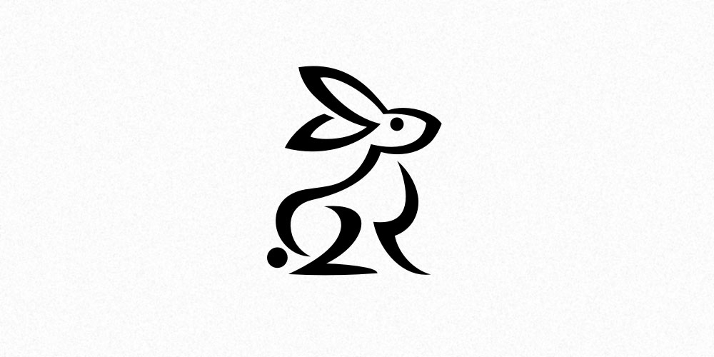
A rabbit depicted in a very unique way, and this style is clearly its greatest advantage. It is unlike any other rabbit depiction I have seen, it draws attention and instantly makes viewers interested. Even though it is sitting, smooth lines with sharp endings introduce some dynamic to it, and in this position our rabbit looks proud and dignified.
For me, the choice here was very simple. Or you could as well say that there was no choice at all. D easily trumped its competition, as it embodied every design principle we had established for this project. It is serious, unpretentious, memorable, strong and just plain simple appropriate. I knew it would work great in any application and — last but not least — it was a rabbit.
The client gladly agreed with my recommendation, so there was no need to withhold further development of this concept. And it clearly needed some more work as its lines were not yet perfect, and the lettering was not even a sketch yet — it was there just to indicate that there should be a name next to the rabbit (that's why I have entirely omitted it in the above presentation).
We needed to create some proper lettering for the logo, as it had been completely ignored up to this point. I knew I wanted something firm and respectable, so that it would further enhance Królik's perception as a producer of reliable equipment.
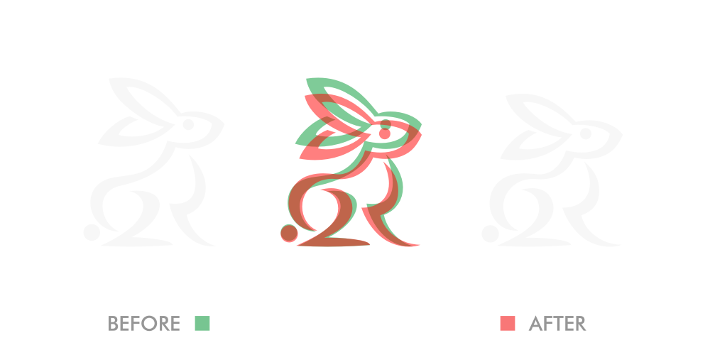
Next in line was the rabbit itself. I wanted to try and make the lines fill the space more evenly, so that the whole drawing would be more balanced and uniform. There was also some room for improvement in the width of the lines and I felt like rabbit's proportions and its pose could use some modifications too. Real rabbit can't really sit and look like it has been depicted in the initial concept, although it might not be obvious at first sight.
Both these upgrades put together and colored (hover mouse over the picture).
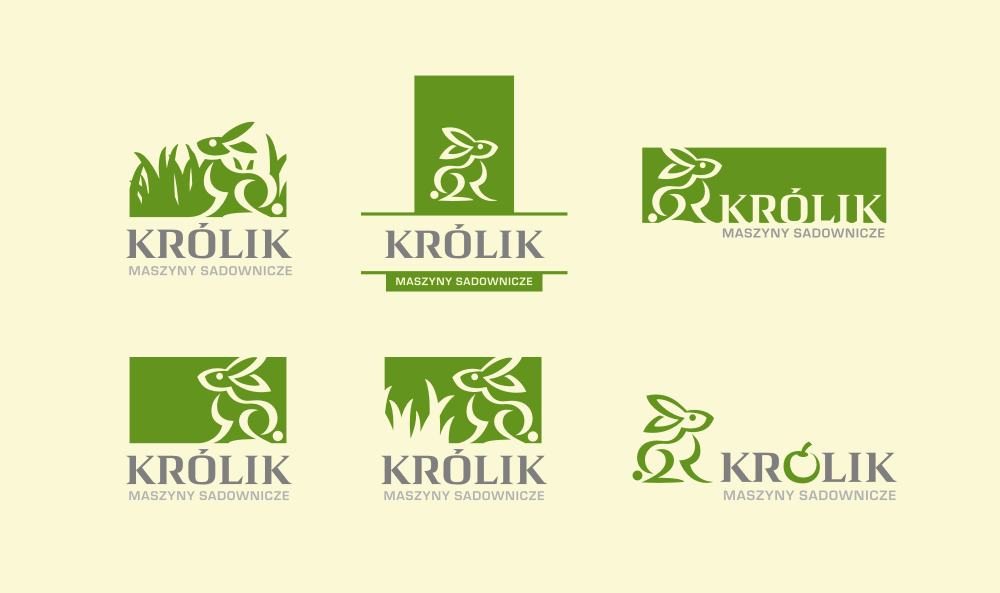
My client also wanted to try out different versions of this concept with the rabbit enclosed in some shapes. Even though I was skeptical of this idea I have prepared some possible alternatives.
The lesson was that any attempt to lock our animal in a closed space feels forced and doesn't bring anything valuable to the table. Luckily, it was evident to my client as well.

Green rabbit was all nice and dandy, but it was the most obvious choice for an agricultural company and well overused within this industry. I wanted to try out something else. I started playing around with various color combinations (and even presented some of them to the client), but when I have come up with this palette it has instantly struck me as the perfect match for our logo.
