Photo Tours Abroad offers photography workshops in locations all around the world. Their client base consists of professionals, as well as amateurs who are serious about their hobby. It is photography first and travel second.
After years of growth and expansion the company found itself in a branding limbo — using a mix of different logos, many of which seemed like ad hoc solutions. Fresh and consistent look was badly needed.
New logo had to be simple and smart, with a clear message of experience and quality. It also needed to be classy, so it could appeal to a rather sophisticated group of people, who are interested in fine arts. Naturally, everything had to revolve around photography and travel.
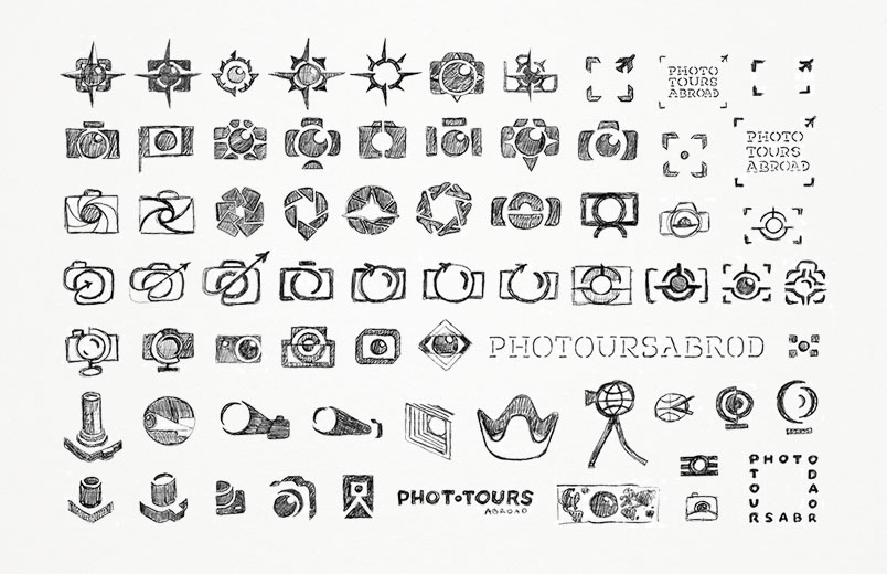
Designing a photography logo is a somewhat notorious activity, as the area is littered with hundreds of concepts recycling the same clichés. I went through all of them in my drawings, but luckily I was able to stumble upon a few ideas that felt quite fresh.
The first three designs are all reasonable, but also clearly inferior, as they would easily blend into the background of the usual photography logos. But it were the last two concepts, which seemed to posses the real potential.
The first of the two fuses photography (camera lens) with travel (globe) into one, esthetically pleasing symbol. The other one tries to do the same through a different approach (frame and plane), but also smoothly incorporates the lettering into the design. Well, maybe not exactly smoothly yet, as these are all just preliminary ideas, but the promise was clearly there...
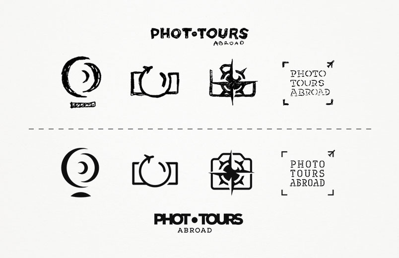
After some structuring and development both designs turned out great. But we had to choose, so in the end my client decided that the globe idea might not be clear enough for all viewers. Therefore, the frame concept became the winner.
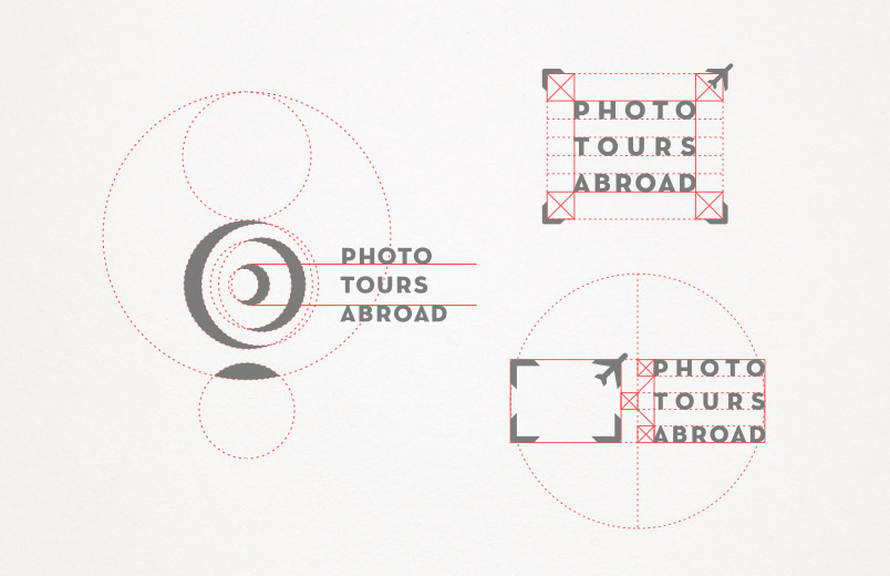
Everything about it already seemed right, but just to be sure we have tested out various modifications (spacing, warping the text, different proportions, etc.). None of these really worked, but it was nice to know that the initial arrangement was in fact the perfect one.
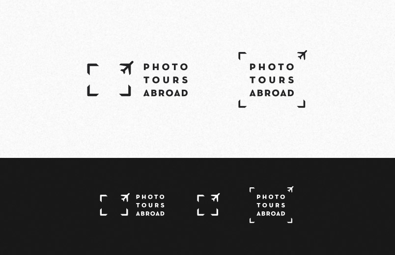
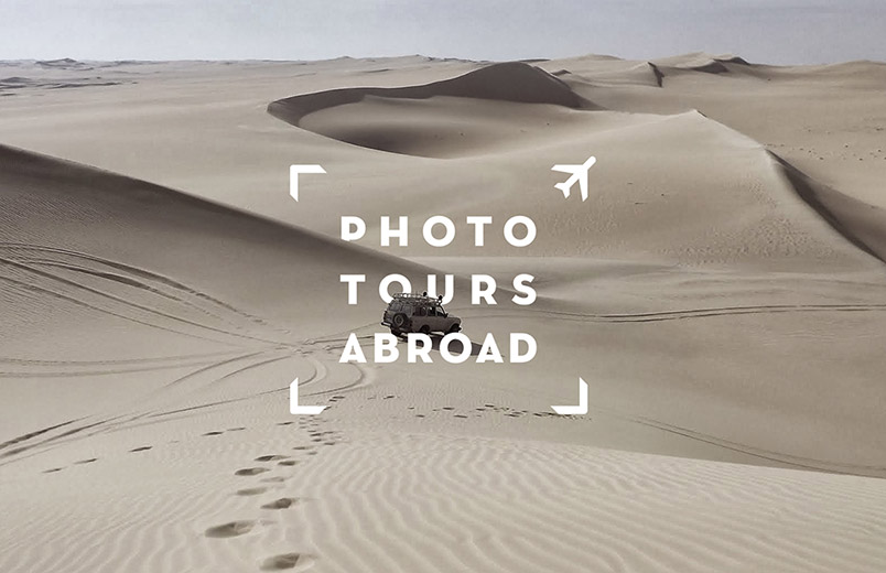
The new Photo Tours Abroad logo is everything it was meant to be, seamlessly merging photography and travel in a harmonious, classy and clever fashion.
All of this was possible thanks to my clients — Ian Ford and Mark Anderson — who not only provided great briefing materials, but were also very open to discussion and my suggestions. I hope this design will serve them well.