Talixo is a leading provider of B2B people transportation in over a thousand cities and 130 cities worldwide. Their original logo – being a legacy from their humble beginnings – did not reflect their current position and was in bad need of change.
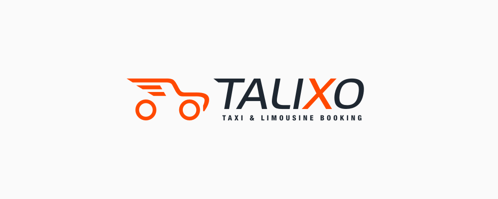
Outdated, quite amateurish and, probably worst of all, untrustworthy. A toy car, oversaturated orange and shabby lettering all bring to mind maybe a niche website or some start-up just crawling out of the garage, but definitely not a large and thriving company, whose offer is primarily focused on serious corporate clients.
The boundary conditions for the new logo seemed quite obvious but also very general: simple, memorable, aesthetically pleasing, inspiring trust, functional as an application icon and based on some car-shape, if possible. The key issue was, of course, the target group, i.e. business customers and comfort conscious tourists.
With such loosely sketched assumptions, our ensuing work necessarily had a strongly exploratory character and was yet to reveal a more specific direction for further examination.
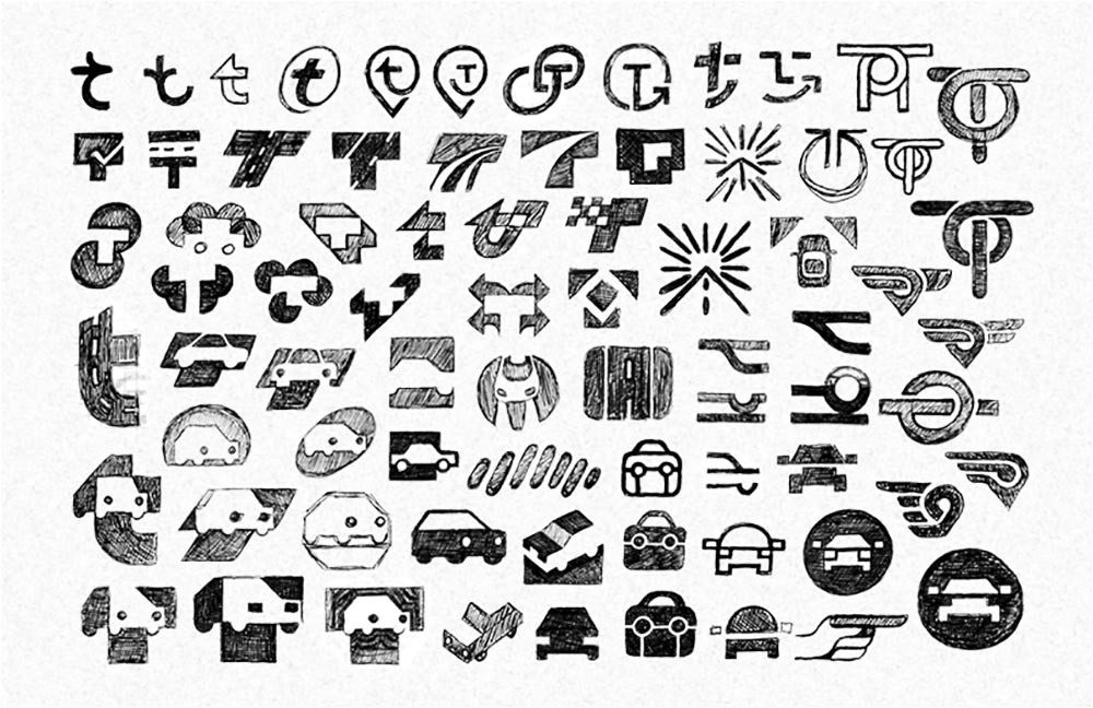
Various visual variations of a car motif, as well as some probes based on the initial of the name and general symbolism related to movement and travel.
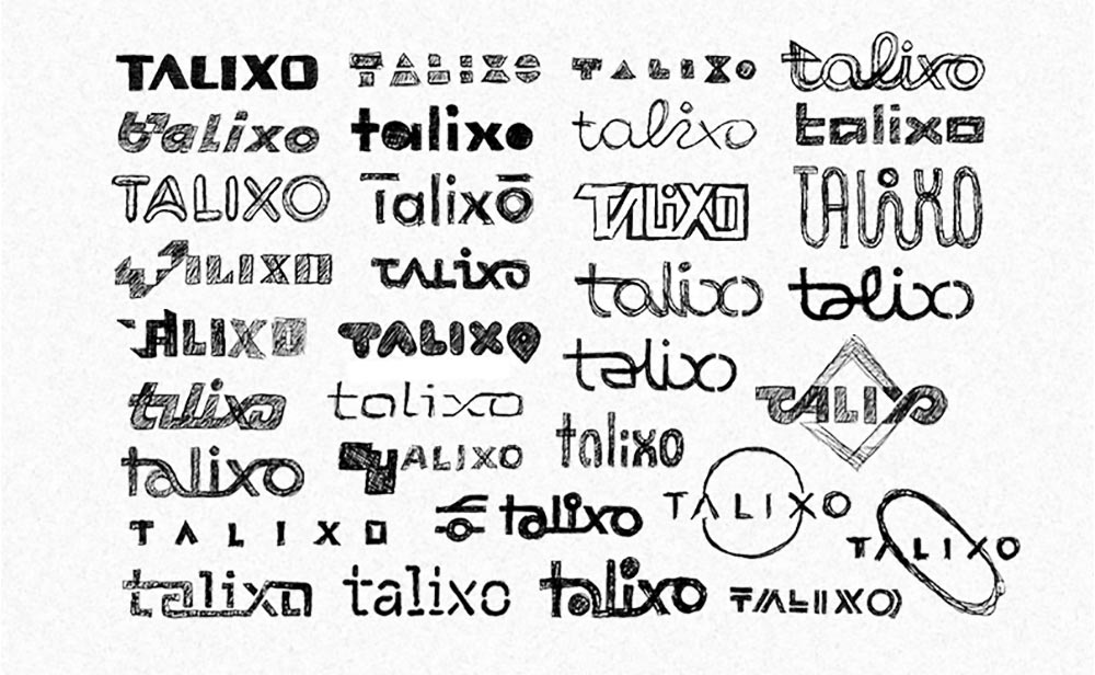
I have also explored possible representations of the company name. Several intriguing possibilities have emerged here, which, however, did not translate directly into the final Talixo logo.
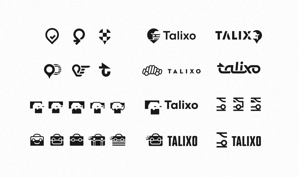
What I am showing here is just the tip of the iceberg of options we have tested. Most of them were either uninspired, too literal or even childish. Only one of the drawings was able to arouse my client’s enthusiasm. Which meant that we could focus on it from now on.
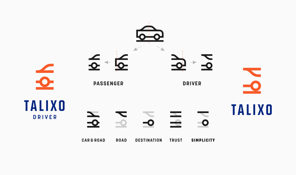
The selected design was based on a section of a simplified car outline. This gave us not only a minimalistic, unconventional representation of the vehicle, but also the opportunity to expand this concept with a complementary sister sign, which could be used, for example, as an icon for the version of the application for chauffeurs.
Although the concept of twin symbols fell through in the end, it was not without significance. We have decided to shift our attention to the additional drawing depicting the rear of the car, which I originally wanted to allocate to drivers.
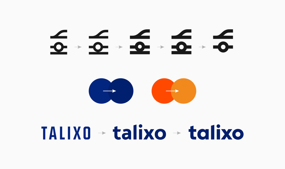
We might have gone through several dozen variations of the car drawings, but the final changes boil down to thickening of the lines, removing the element symbolizing road and lowering the roof. One of the main motivations behind these modifications was the desire to bring the symbol closer to a square-like proportions. Which would facilitate its use in a smartphone environment, which is particularly important for Talixo.
We have also gone through a similar process with the lettering. Finally, we have decided to convert letters to lowercase and switch to a more regular, geometric sans serif typography, which allows a better visual connection between the name and the symbol.
And, at last, the colors. We wanted to keep the original orange, which had already gained pretty strong connection with the brand, but it obviously needed to be cooled down. In addition, we have introduced navy blue to the mark, which we only slightly darkened compared to the original proposal.
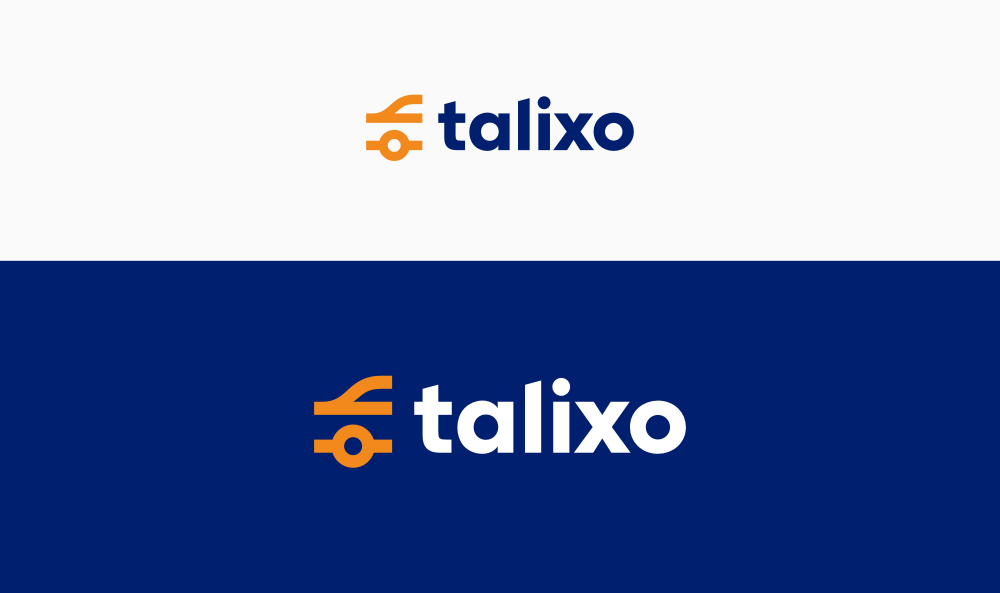
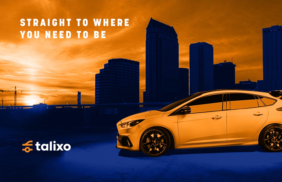
The new logo is a drastic change compared to the previous mark: more respectable, professional, unique and, at the same time, simpler and cleaner. Undoubtedly, it will also be more functional and easier to find in the maze of application icons on users’ screens. Most important of all, however, is the fact that Talixo finally owns a mark that corresponds with their market position and their target audience.