Trzech Kumpli (meaning "three pals" in Polish) was a new craft brewery planning to produce their beverages in a contractual scheme, using the facilities of bigger breweries (hence the “flying” moniker). The guy behind it all is Piotr Sosin, who has contacted me about the job of creating a logo for his new endeavor.
We have started out with a few ideas for the brand's symbolism:
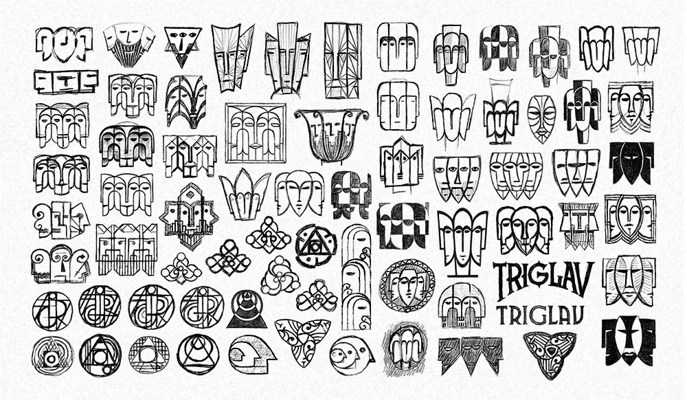
Triple-headed characters have dominated this phase, although a few other concepts also managed to squeeze in.
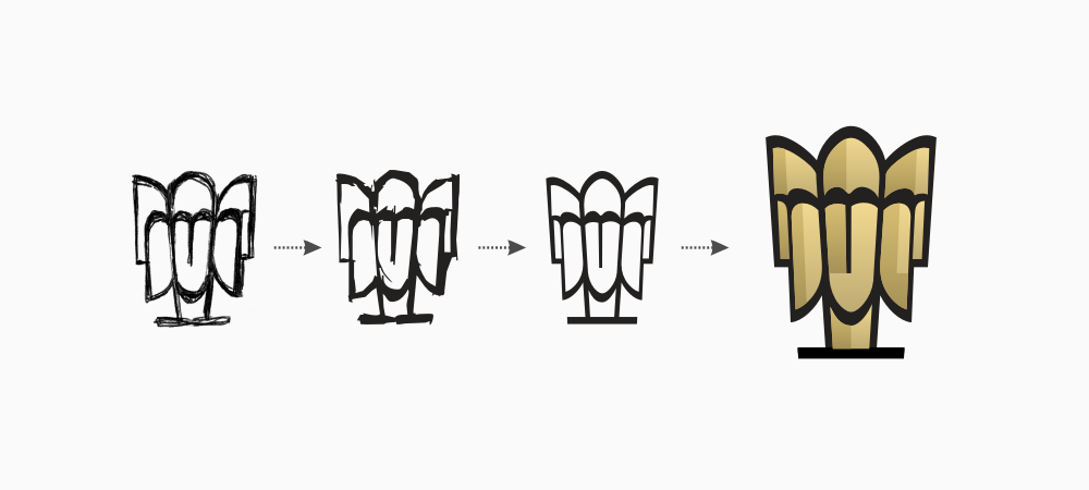
First concept is a simple geometric representation of three friends sitting at the table and having a beer.
Minimalistic and effective.
Second idea refers to Svetovid, the four-headed deity.
Pretty unusual and memorable.
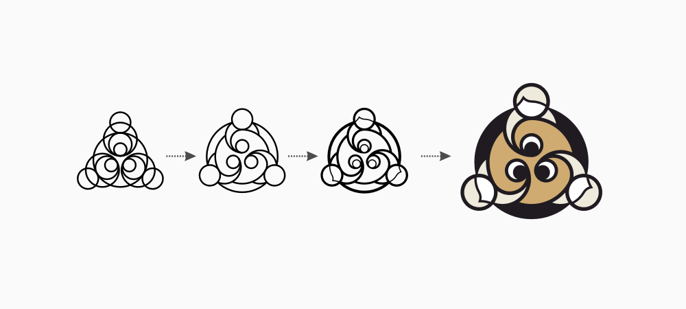
The last one is a more radical and experimental solution. At this point in time different beer styles produced by the brewery were planned to be named after chemical elements, so I thought that some alchemical symbolism might be an interesting approach (the initial shape stands for the philosophers' stone).
The first design has been selected as the winner of the first stage, due to its simplicity and clear representation of the company name. But it was still far from perfect and in need of quite a bit of tweaking.

My client rightly pointed out that the initial draft was a little too heavy, while beers were too dark for the first (and most important) brew of the company's light beverage. While working on these elements I have also come up with the idea of encapsulating the whole logo with a cap-like shape, that would clearly suggest some kind of beverage.
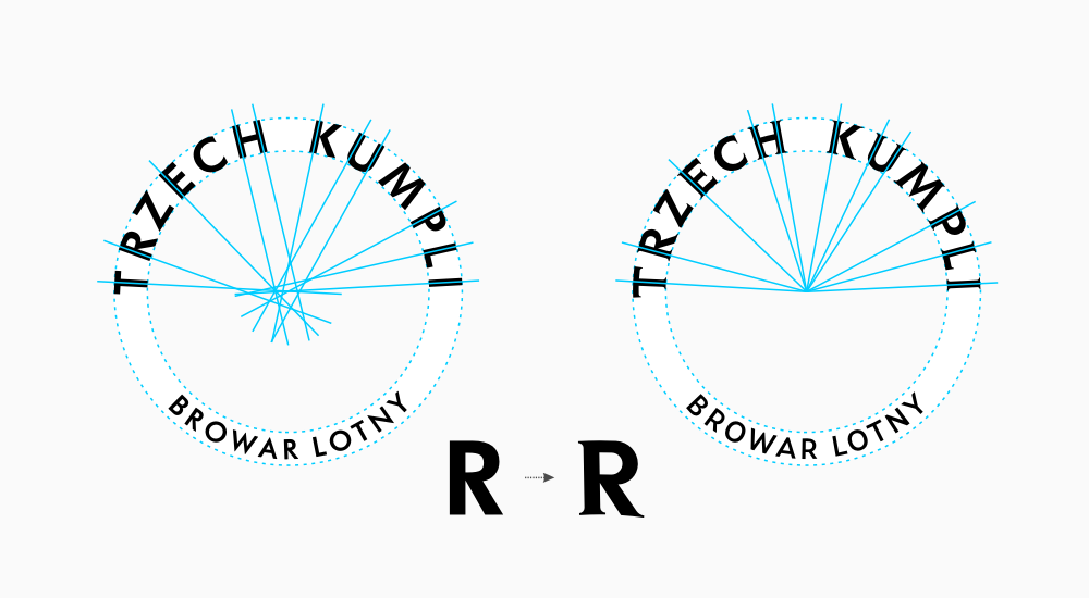
At this point the lettering was far from satisfactory — glyphs were just placed on a curve, not following it, and they were not "open" enough for optimal readability at small sizes. Accompanying image shows how it all got radically improved.
We were quite happy with the result we got: very geometric, unique and unpretentious, but at the same time unmistakably beery and proudly representing our three buddies.
But the logo design turned out to be just the beginning of a cooperation between me and Trzech Kumpli...
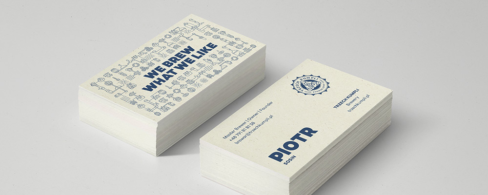
Apart from the basic logo for the brewery, we have also cooperated on many more additional materials.
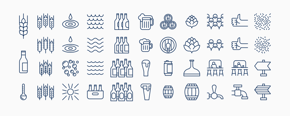
A whole collection of beer-related symbols constructed along similar lines as the logo itself. It has proven to be a very flexible tool in Trzech Kumpli’s marketing arsenal.

Icons can be used individually or, as presented here, as a space-filling pattern.
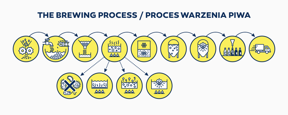
Even more symbols, this time specifically for each of the steps critical for beer productions. Those of you who are curious about the details can learn more on Trzech Kumpli's website.
Simple, clean and elegant.
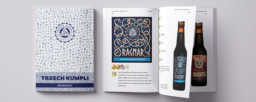
An in-depth catalogue covering the whole lineup of beers produced by Trzech Kumpli.
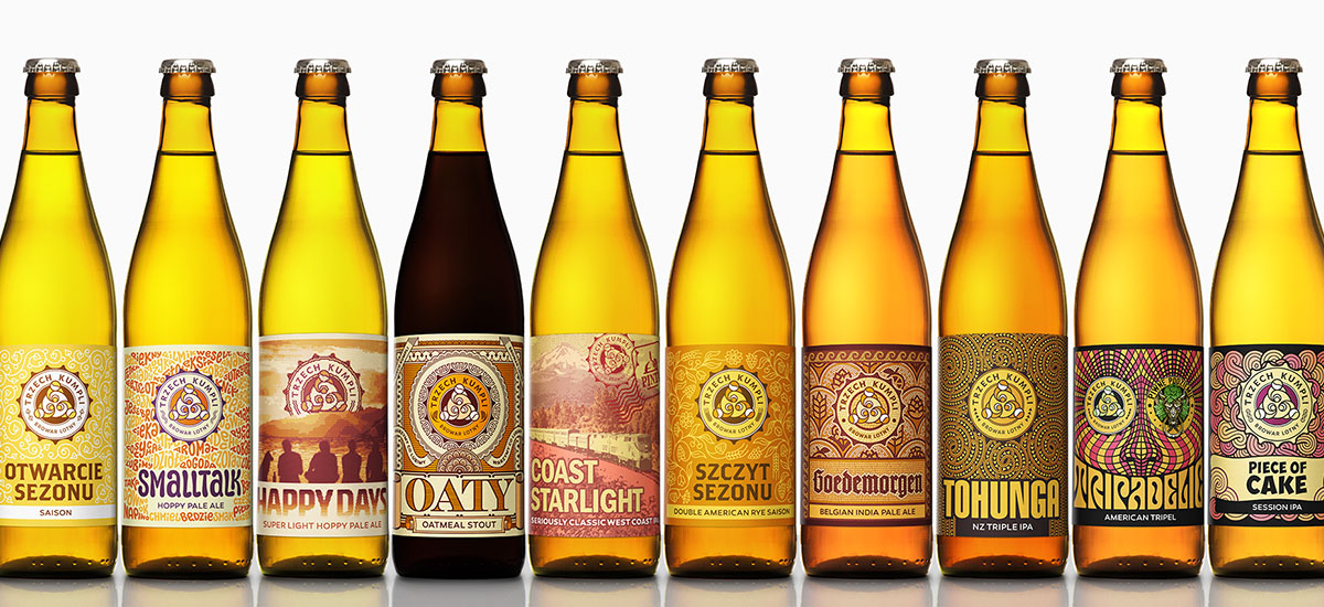
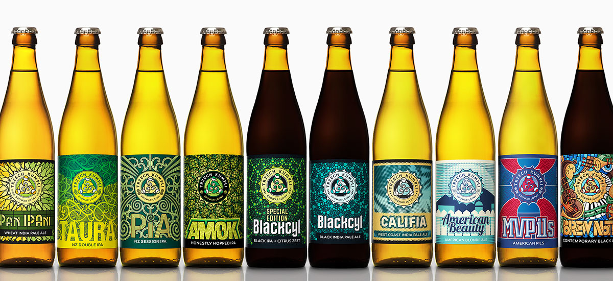
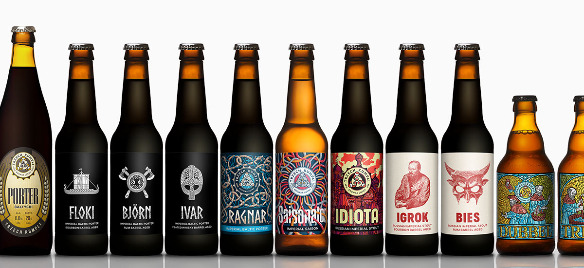
Finally, the most extensive part of our collaboration: beer labels. Up to this point we have created over 40 unique designs all sharing a similar esthetic. This number is soon to be out-of-date, as the brewery is not showing any signs of slowing down.