ProfisBud is a producer of timber houses. For their clients they construct “unique projects of innovative houses”. In future, they plan to widen their offer with ready-to-build projects.
Client described ProfisBud as a company taking pride in the quality of their services, beauty of realized projects and the fact, that the main building material is elegant wood. Therefore the tagline — “Piękno płynie z natury” (“Beauty comes from nature”) — planned to be included in the final design. Logo should also be able to induce trust and assure clients of company's reliability and experience.
Another important assumption was to avoid falling into tired cliches popular within their industry, such as: roofs, doors or trees. Client has also suggested that using a silhouette of some noble animal, as a mean of representing company's values, might be an idea worth trying out.
After the initial exchange of thoughts I reduced gathered information into a group of keywords, which were supposed to inspire me down the road and home me in on our target:
After digesting all of the received information and doing some research on company's competition (especially their brandmarks), I knew that I want to concentrate on a design consisting of lettering and a separate graphic symbol. In such situation, I usually start the job with sketches of the symbol, and at this point I had three main ideas for it:
Last concept required specifying exactly which animal would be best suited for the job. After having given it some though, I decided that a deer is a perfect fit — noble dweller of the woods, an animal of undoubted elegance and gracefulness. Moreover, it is not a predator – which could possibly bring in some unwanted aggressive connotations – nor it is an animal associated strictly with any specific symbolism or industry.
Having determined design priorities and initial directions of attack, I got to the next stage of the design process, which would be the good old paper sketching. As consecutive ideas were materializing in my sketchbook, I transferred them to a computer to be polished and modified. Initial batch of proposals consisted of 10 graphics, falling more or less into three categories I had had in mind in the beginning:

Lettermarks — stable, solid, elegant. B seems to be communicating quality especially well, while A's shape might even resemble beams of timber. Although, both of them seem to lack any “nature” traits.

Projects in which I tried to capture company's field of interest. C is really literal, almost banal. D seems to be an interesting idea, although probably too conceptual and not best suited for ProfisBud.

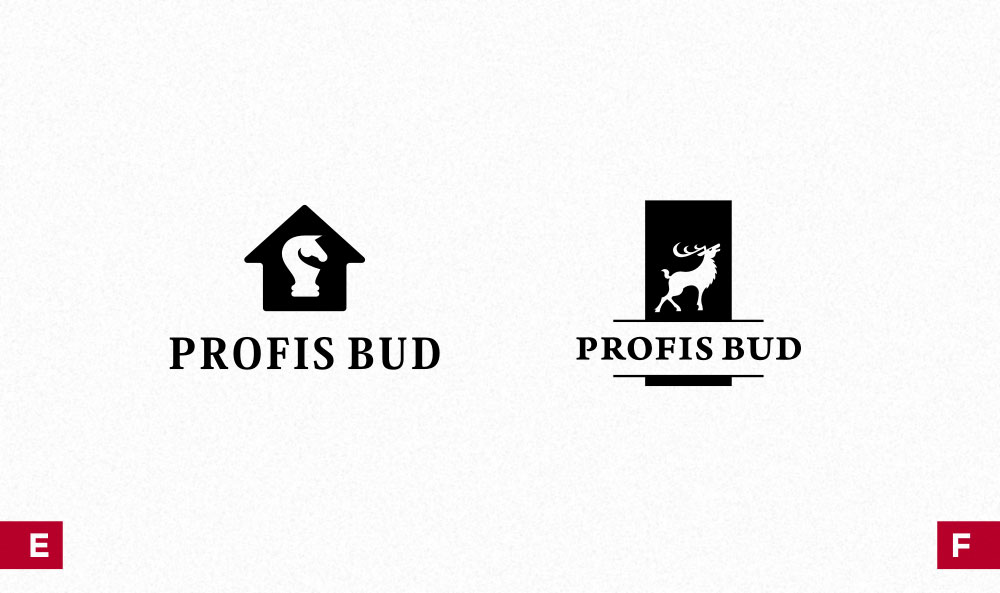
E — chess horse placed on a house outline. Chess connotations feel quite appealing, but at the same time they might be unnecessarily diluting the company's message.
F — deer's silhouette in a “crest” form. Deer seems to be passing the test, and that's why I explored the idea further in successive designs.

Attempts of making the deer concept more unique. In both versions I tried to use a more dynamic lettering. H stands out because of the deer's depiction — simplified and stripped-down to abstract curves.

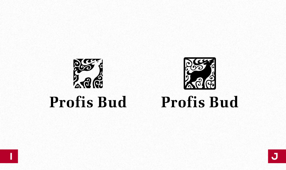
Further experiments. This time I surrounded the deer with something resembling a floral ornament, which might even resemble wood-carvings. As you can see, this project is not far off from the final result.
I was pretty happy with all the proposals shown to the client, but at the same time I had no problem with pointing out my favorites: projects I and J stood head and shoulders above other options, as they communicate the desired message comfortably, their form is memorable and, last but not least, they are also quite pleasing aesthetically.
Luckily, persuading my client to this ideas wasn't needed, as he shared my feelings about the presented proposals. At this point I also knew, that the combination of dark and light greens – additionally emphasizing naturalness of the ornament – is the right way to go for this project.

Here I briefly demonstrate how the selected proposal evolved from sketches on paper to a more developed form.

Abandoning the outline. Redrawing the whole image, especially the deer and its antlers. Adding ornaments.
Simultaneously to modifying the symbol I was also working on lettering. The original version was more of a rough sketch of where I wanted to go, than a real proposition of the final design. It was clear to me, that the wordmark should supplement the elegance of the mark, so an obvious idea was to use a serif font. The fine and subtle construction of the symbol was another argument for such a solution — simple, sans-serif font might be too much of a contrast against it.
In the initial designs I used classically built, not yet modified font. Although it fulfilled some of the assignments, it felt a bit stiff and not as imaginative as the deer symbol. I wanted to get lettering with a more “organic” feel; something that would relate to the beauty of nature, rather than elegance of strict rigors of traditional typography.
After some try-outs, I was able to come up with a satisfying solution, which included tasteful shapes, soft, more floral curves and not-routine serifs. Additional element that contributes to a harmonious composition of the lettermark is the “FI” ligature. It also gives it a nice little touch and makes it more unique. The final part was the tagline to come with company's name - appropriately, it also got a bit more organic form.

Notice soft lines and rounded corners, which correspond to the structure of the symbol. Another thing worth pointing out is the elegant “FI” ligature.

