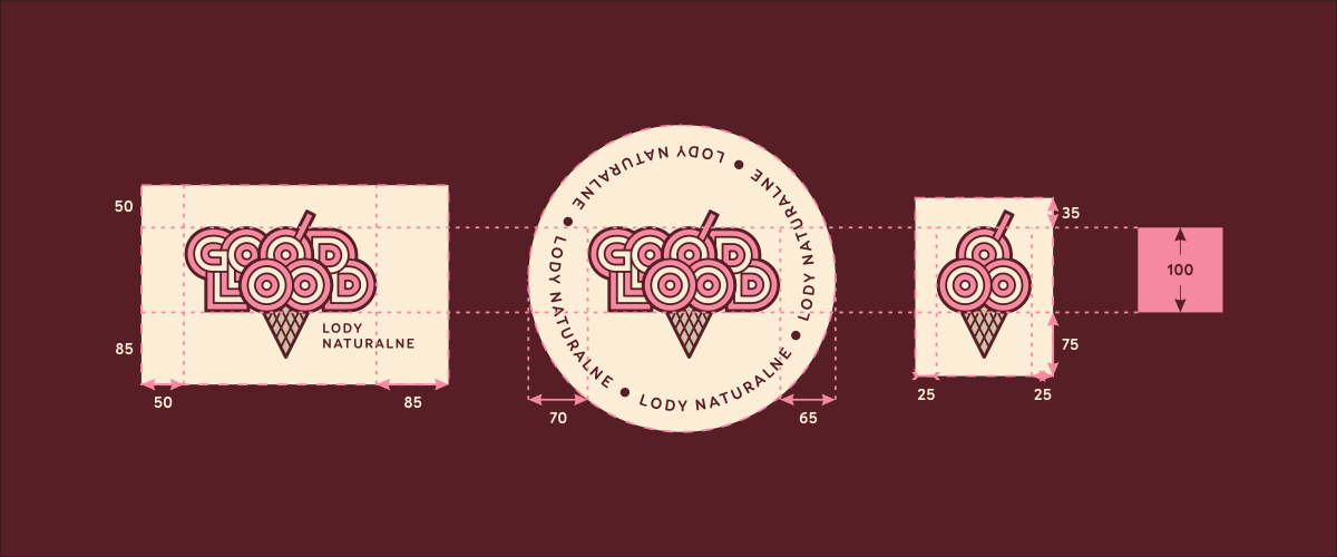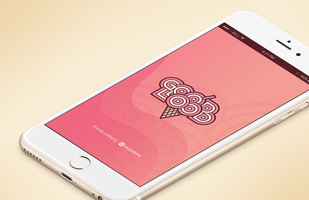
Good Lood is a chain of ice cream parlors located in Krakow. Its founder – Mr. Sławomir Wolf – is a man who loves his ice cream and who was very quite unimpressed by the offer available in Krakow at the time. His ambition was (and remains) the production and sale of ice cream from natural ingredients of the highest quality in a wide range of flavors. Good Lood’s first point of sale (the so-called Loodspot) opened in May of 2016 and it quickly turned out that its offer perfectly fitted the customers’ expectations.
But let’s go back to the story of how we have created their logo…
In addition to the issues mentioned above (high quality, natural ingredients, differentiation from traditional ice cream shops), one of the key elements – as it has turned out later – was Mr. Sławomir's suggestion in the form of a drawing.
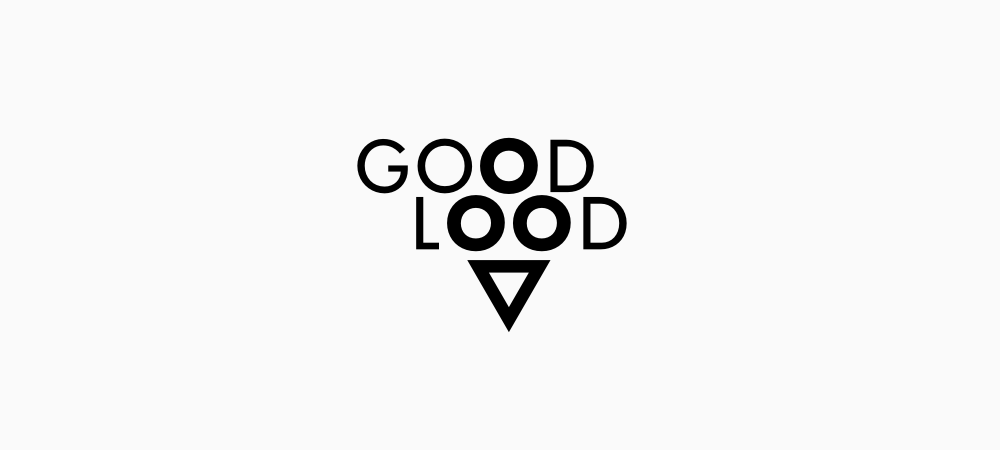
The accumulation of letters "O" opens a wide field of possibilities for their use as a “construction material”. The accompanying drawing is a reproduction of a sketch provided to me by the client at the start of our cooperation.
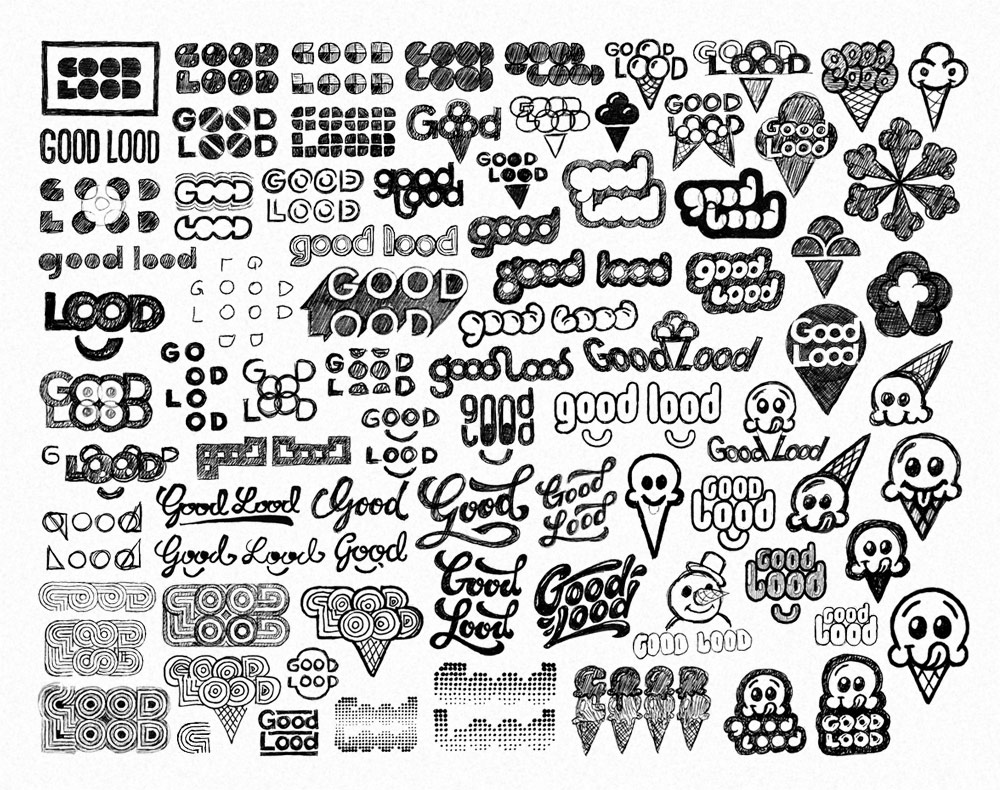
Sketching ideas and exploring their potential on paper is an essential stage of logo design. At least for me. There are several main paths of attack visible in the compiled graphic: strictly geometrical approach based on the brand name, attempts at squeezing something fresh out of the ice cone concept, script lettering, efforts at creating an ice cream mascot, and various combinations of these ideas.
Scribbling on paper is followed by translation of most promising ideas into a cleaner form that can be presented to the client. These are not yet ready-for-use projects, but more like seeds of concepts that, after further development, could grow to become the logo of a brand or company.
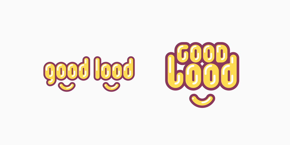
A simple and warm mark based on the specific arrangement of letters making up the name. Double-O’s are used as eyes, and the face takes shape thanks to the smile placed below. The result is a compact, balloony wordmark with an irresistibly positive vibe.
The main downside is that the procedure with a smile has been so overplayed that this design might easily disappear in a crowd of similar marks.
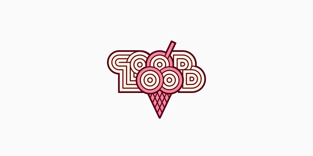
By far the most subdued and balanced option in the whole collection. Once again it is based on the arrangement of letters in the brand name, although this time I have strictly followed my client’s original suggestion. And so we have ended up with three ice cream scoops in a waffle cone incorporated into the Good Lood name.
I have approached this task in many different ways. Usually, it was possible to obtain either a clear ice cone, a fully legible name, or the overall harmony of the sign. Each time at least one of these key features fell victim to the others. The logo design visible here is by no means perfect, but at least it clearly demonstrates the potential for development of this concept.
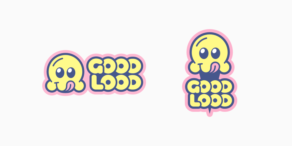
An approach that could be seen as the combination of the features of two previous drawings. It is friendly and straightforward as the option A and, at the same time, it contains a clear reference to the ice cream offer of Good Lood, just like project B.
The hero here is a smiling ice cream scoop with its tongue sticking out. This sets the overall mood of this logo concept and could possibly provide the brand with a welcoming mascot. It teems with positive, warm emotions and an almost literal promise of deliciousness on the offer. It seems that the ice cream cone cliché – which could become a burden for the brand if improperly handled – has been transformed into a character that bring only positive values.
During my work on this concept, I have considered the possibility of replacing the scoop, or topping it with, optional shapes (hats, Pac-Man ghosts, clouds, UFOs, etc.). It could have become the basis of a flexible “logo system” that could be changed, mixed and matched according to various marketing needs (seasonal variations, promotional campaigns and just simply having some fun with the mascot).
My personal favorite from the original group was proposal C: simple, nicely structured and with considerable potential for further development and appealing to the youngest customers.
However, it has turned out that I had been barking up not quite the correct tree. Up to this point, I have assumed that children were the principal audience for Good Lood, where, in fact, the brand had been planned mostly with teenagers and young adults in mind (or at least not with children as its dominant target group).
This was a pretty serious communicational oversight on my part. But luckily, we still had option B in our sleeve. Not as infantile as other designs and based on the original idea by my client. At this stage, the legibility of the name (in particular the letter "G") and underdeveloped details were still a serious problem, so we had our work cut out for us.
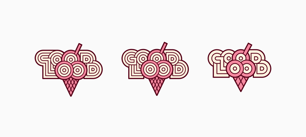
Original, modified and simplified.
The simplified variant seems to lose a lot of personality when confronted with the original drawing. This route appears to be a dead end. On the other hand, the corrected version of the wordmark seems to be a major progress: I have finally managed to improve readability, connections between letters appear more natural and less forced, there is even a boost in the overall coherence and aesthetic of the mark. The key to success here was, above all, rebuilding the initials and making them play along with the other letters.
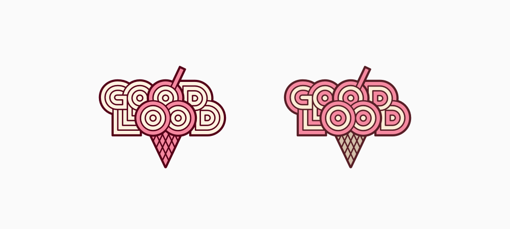
Another important stage in the development of the project was the change in the distribution of colors in the wordmark. The introduction of alternating color stripes throughout the name has improved the name's clarity and harmonized the design. Giving the cone a more waffle-like and subdued color has shifted it to the background, and, consequently, additionally emphasized the name.
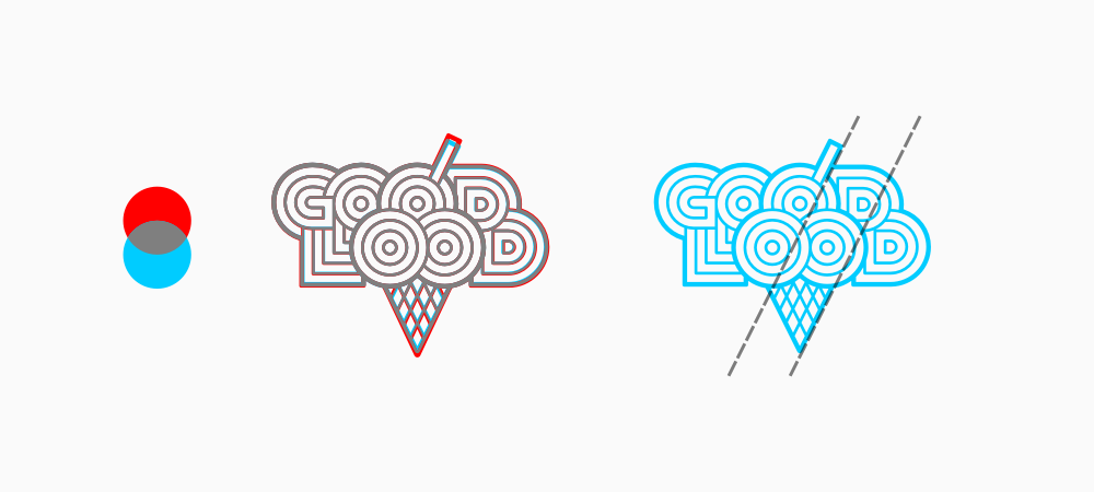
Improvements in details:
Our cooperation has produced a compact, unique and memorable mark, which – despite relying on a fairly classic representation of the ice cream cone – avoids cliché and is a great symbol of Good Lood quality. This logo has already become a familiar element of the Krakow’s cityscape and is recognized by a significant part of the population.
Both the logo described here, and the network of loodspots behind it, has turned out to be a success greater than we might have expected it to be. Currently, there are a dozen or so Good Lood parlors in Krakow, three more in Warsaw and I'm afraid they are not planning to stop there!
